
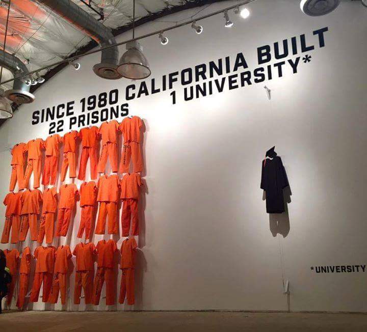
FOR ADDITIONAL INFORMATION USE LINK :
http://m.huffpost.com/us/entry/1863101
EXTRA INFORMATION :
FOR ADDITIONAL INFORMATION USE LINK : http://m.huffpost.com/us/entry/1863101 EXTRA INFORMATION : http://www.washingtonpost.com/news/wonkblog/wp/2015/01/06/the-u-s-has-more-jails-than-colleges-heres-a-map-of-where-those-prisoners-live/
Subscribe to get the latest posts sent to your email.

This kinda reminds me of a billboard I saw next to the I10 in Indio – it said something like ‘Cost of 3 years of prison $43,000, cost of 3 years of college, $9,100’. What it doesn’t mention is that for the latter option, this doesn’t include hard work, living expenses, the interest on the $9,100 or the fact that you have to pay for it (or your parents); while the former option comes with three hots and a cot and you don’t have to worry about qualifying for or paying for it.
Ah, it posted before I’d finished: This is not a criticism of your post, or of the sad truth of both, just an observation of the missing information on the billboard.

Thanks for the advice.
Hmm, very interesting and surprising map – I thought Cali would be one of the highest prisoner/population ratio.

That’s scary.




Leave a Reply